Since version 2022, the Eplan GUI items are accessible through a ribbon. In the API this control is represented by the following classes:
The ribbon is divided into tabs and these tabs into command groups and commands.
All ribbon related classes are stored in the Eplan.EplApi.Gui namespace. They correspond to the types of ribbon items from the GUI:

Prior to version 2027, custom commands could be created with either a small icon or no icon. Starting with version 2027, it is also possible to create custom commands with large icons.

Additionally, version 2027 offers dropdown button functionality: You can now create dropdown commands that open a dropdown list of subcommands when you click the small arrow. You can specify whether the dropdown root command itself should act as a button and execute an action, or whether it should simply open the dropdown list:

For more details on the large icon buttons and the dropdown buttons, please refer to the corresponding sections below.
Here is an example of listing ribbon items (tabs, command groups and commands):
Please keep it in mind that some tabs are context sensitive, i.e they are open only when the editor is visible.
The old menu and toolbars are no longer accessible. The equivalent of the old menu point / toolbar button is now the ribbon command:

In the API, commands can be created in the following places:
The classes corresponding to the old GUI items i.e. Toolbar and Menu are removed in version 2026, so it is essential to migrate relevant code.
The following table shows how to create new ribbon items and provides example code:
| Old GUI item | Old API method | New GUI equivalent | New API method | Example old code | Example new code |
|---|---|---|---|---|---|
| Main menu | Menu.AddMainMenu | RibbonTab | RibbonBar.AddTab | menu.AddMainMenu("API Tests A-N", Menu.MainMenuName.eMainMenuHelp,"AddingMessageAction", "AddingMessageAction", "First menu element", 1); | var ribbonTab = ribbonBar.AddTab("API Tests A-N"); |
| Popup menu | Menu.AddPopupMenuItem | RibbonCommandGroup | RibbonTab.AddCommandGroup | menu.AddPopupMenuItem("ActionExample - test2","ActionExample - test2 submenupoint1", "ActionExample", "status text", mainID, 0, false, false); | var commandGroup = ribbonTab.AddCommandGroup("ActionExample - test2"); |
| Toolbar | toolbar.CreateCustomToolbar | RibbonCommandGroup | RibbonTab.AddCommandGroup | toolbar.CreateCustomToolbar("SelectionSet", Toolbar.ToolBarDockPos.eToolbarLeft, 4, 1, true); | var commandGroup = ribbonTab.AddCommandGroup("SelectionSet"); |
| Menu item | menu.AddMenuItem | RibbonCommand | RibbonBar.AddCommand, RibbonCommandGroup.AddCommand |
menu.AddMenuItem("UndoAction", "UndoAction"); menu.AddMenuItem("SelectionRecursive", "SelectionRecursiveAction", "", selectionSetID, 1,false, false); |
ribbonBar.AddCommand("UndoAction", "UndoAction"); commandGroup.AddCommand("SelectionRecursive", "SelectionRecursiveAction"); |
| Toolbar button | toolbar.AddButton | RibbonCommand | RibbonCommandGroup.AddCommand(…,index) | toolbar.AddButton("SelectionSet", Int32.MaxValue, "SelectionOneItemAction","C:\\myicons\\0.ico", "SelectionOneItemAction"); | commandGroup.AddCommand("SelectionOneItemAction", "SelectionOneItemAction", 0); |
Here is also a list of other old methods and their new counterparts:
| Old method | New method |
|---|---|
| Toolbar.ExistsToolbar | RibbonBar.Tabs.Any(by LINQ) RibbonBar.GetTab RibbonBar.GetDefaultTab |
| Toolbar.GetButtonAction | RibbonCommand.ActionCommandLine |
| Toolbar.GetButtonToolTip | RibbonCommand.TooltipText |
| Toolbar.GetCountOfButtons | RibbonCommandGroup.Commands.Count |
| Toolbar.GetPersistentButtonId Menu.GetCustomMenuId GetPersistentMenuId |
RibbonCommand.ID |
| Toolbar.RemoveButton | RibbonCommand.Remove |
| Toolbar.RemoveCustomToolbar | RibbonCommandGroup.Remove |
| Menu.IsActionChecked | RibbonCommand.IsChecked |
| Menu.IsActionEnabled | RibbonCommand.IsEnabled |
| Menu.RemoveMenuItem | RibbonTab.Remove RibbonCommandGroup.Remove RibbonCommand.Remove |
The ContextMenu class is not affected by this change, i.e everything works as before version 2022.
For more information, please refer to chapter "The New Ribbon" of the Eplan Help.
Ribbon command actions can now be created with .svg icons. There is a list of standard CommandIcons, accessible by name or index number.
Furthermore, below examples present also how to use custom icons, which can be added by specifying path to .svg file or providing icon content in string format.
Adding standard icons
Adding custom icons
The above examples result in this RibbonBar:

Creating large icon commands
Ribbon icons are small by default, but you can also create a command with a large icon by setting the RibbonIcon.IsLarge property. Since its default value is "FALSE", you only have to set this property, if you want a large icon command. Of course it is also possible to create a command without any icon:
Ribbon command actions can now be created using a RibbonCommandInfo object. This object contains all required and optional properties.
The mandatory properties are:
The optional properties are:
The IndexButtonPosition is used to specify the position in a RibbonCommandGroup.
If they are not left empty, the multilingual properties are used over the corresponding non-multilingual properties in the GUI. If you want know more about how to use multilingual ribbon items, please refer to the "Adding multilingual ribbon items" chapter.
It is possible to add existing Eplan ribbon command actions to a custom CommandGroup via their Command.ID.
The corresponding internal icon is automatically added to the action.
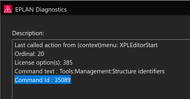
To find the correct Command.ID value for the command, you can check the description log in the Eplan Diagnostics dialog after calling this action from the ribbon (to show the Diagnostics Dialog press [Ctrl] + [VK_OEM_5]. [VK_OEM_5] corresponds to the [^] key on a German keyboard or to the [\] on a United States 101 keyboard.):
You can now add dropdown buttons that, when clicked, open a list of subbuttons. For this, the RibbonCommandInfo object now provides the new IsDropdownRoot and IsSplitButton properties.
In order to create a dropdown button, you first need to create the so-called root command—that is, the part of the dropdown button that remains visible when the dropdown is closed. To do this, use the IsDropdownRoot property. The default value of the IsDropdownRoot property is "FALSE". Therefore, this property must be set to "TRUE" only for the root command. The subbuttons are created in the same way as normal buttons. Then, they are added to the root command using the RibbonCommand.AddSubCommand method. This step identifies them as subbuttons in a dropdown list. Please see the following example:
The root button of the dropdown list can be a button whose sole purpose is to open the dropdown list. Hovering over such a standard dropdown root button (without clicking) will look like this:

However, the root botton of a dropdown list can also be a split button. A split button combines two functions: The split button’s surface is divided into two sections. While clicking the part of the split button with the small arrow opens the dropdown list, clicking the other section performs an action and thus functions as a regular button itself. When you hover over a split button with the mouse, its two sections are displayed:

To turn a root button into a split button, the IsSplitButton property must be set to "TRUE", as shown in the code example above. By default, it is set to "FALSE", resulting in a standard dropdown root button. Consequently, the RibbonCommandInfo.ActionCommandLine property is not considered for a standard dropdown root button. Therefore, the property value can be set to an empty string and does not have to be unique in this special case.
Like any other button, a dropdown root button can be created with a small icon, a large icon, or no icon at all. The subbuttons can only be created with small icons or without any icons.
Our UI libraries provide SVG support with the following limitations:
• Scripts, interactions and external objects are not implemented for security reasons.
• Animations, videos, sounds and internal images are not implemented.
• Since SVG icons should be small and fast to render, we disabled the following SVG elements that can significantly affect drawing performance:
- <pattern>
- <color-profile>
- <hkern>
- <hatch>
- <hatchpath>
- all effects, blend mode and filters
- compressed SVG files (SVGz)
It is strongly recommended to use only simplified ("optimized") SVG: All elements such as text or shapes should be converted to paths and all paths should be combined.
The simplified SVG is small and fast-drawing. In addition, it will be very difficult to "reverse engineer" your media in this case.
